

echo
Turning saved content into knowledge you can actually use.
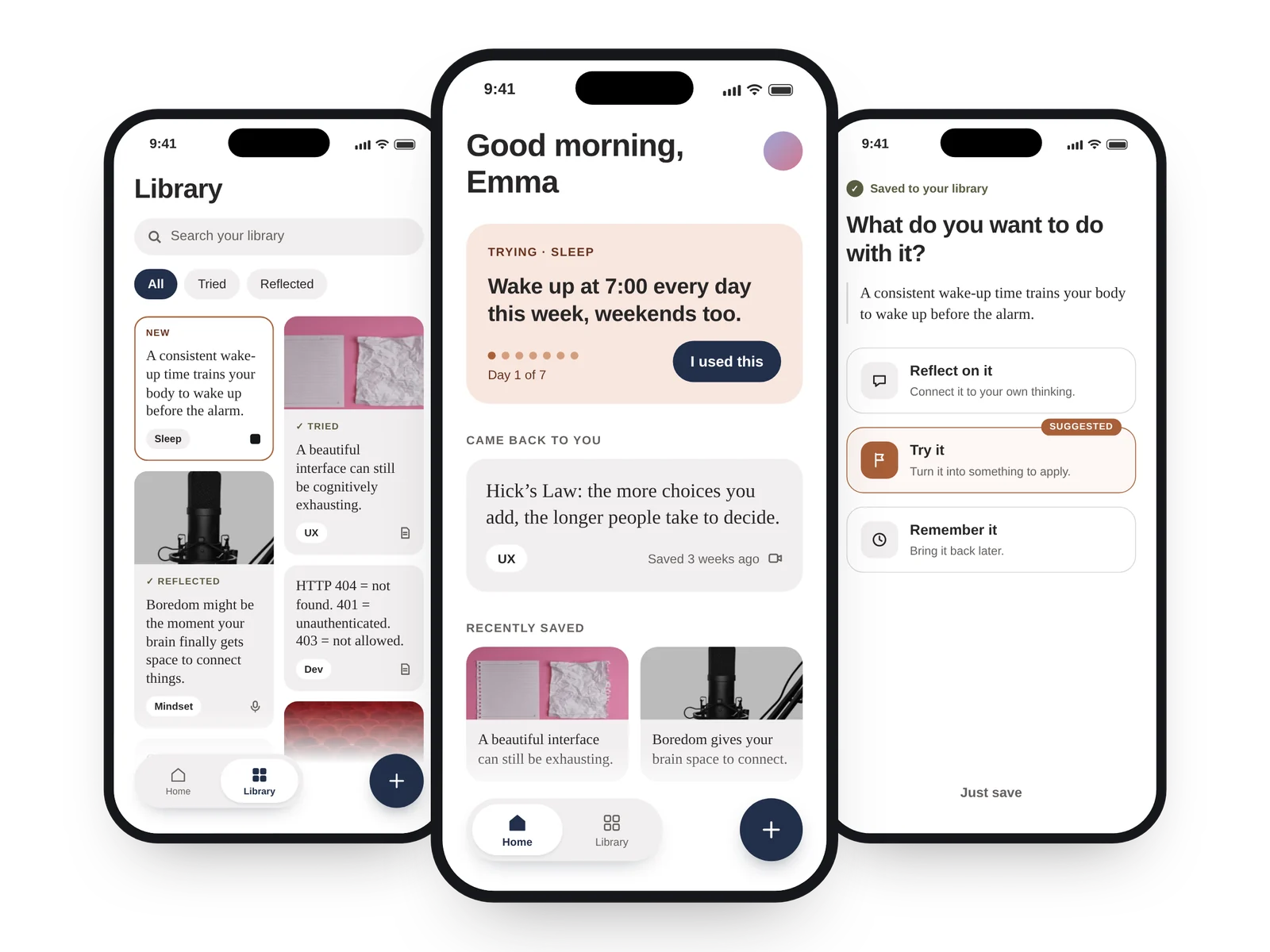
A place for ideas to go after you save them.
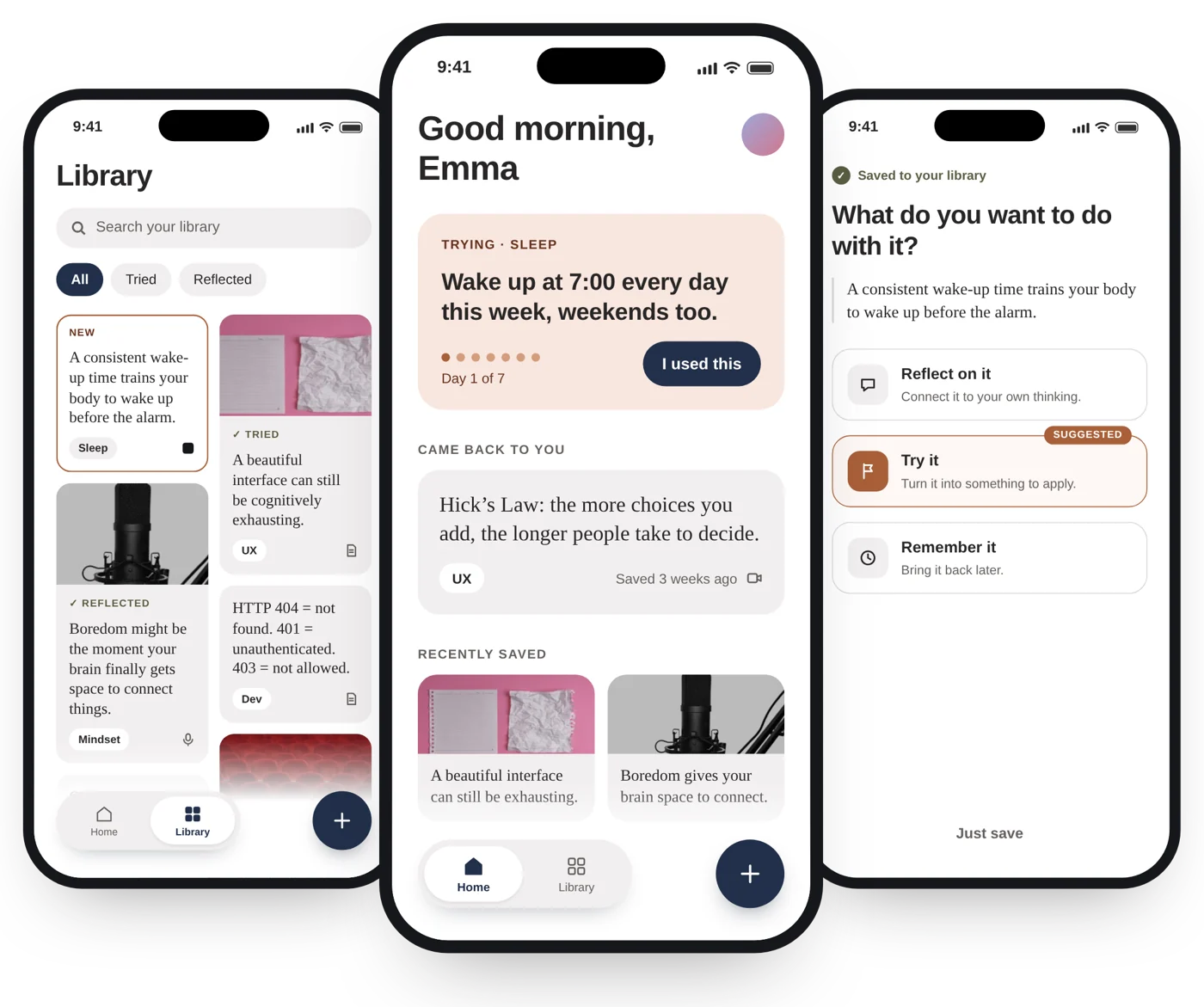
echo is a mobile learning product for curious, self-directed learners. It takes the ideas people collect from videos, podcasts, books and articles and gives them somewhere to go: a moment to reflect, a way to apply them, and a reason to come back to what matters.
We save more knowledge than we use.
Useful ideas end up scattered across screenshots, bookmarks, notes, saved videos and reading lists. Saving gives us the feeling that we'll come back later. Mostly, we don't.
People forget what they learn. It's a memory problem.
Stored knowledge rarely becomes applied knowledge. It's a meaning problem.
Across 3 in-depth interviews and a survey of 11 learners, people didn't describe learning as remembering. They described it as being able to connect an idea, explain it or apply it.
The reframeSo the question stopped being where to store knowledge. It became: what should happen after Save?
Four phases, end to end.
- Phase 1DiscoverDesk research · 3 interviews · survey (n=11) · affinity mapping · behavioural patterns
- Phase 2Define3 behaviour-based segments · persona · problem framing · HMW · opportunity areas · prioritisation
- Phase 3DesignInformation architecture · user flows · mid-fi prototype · interaction model · visual direction
- Phase 4Test & refineThink-aloud tests · prioritised friction · iterations · mini design system · hi-fi prototype · UX metrics
I also benchmarked Readwise, Duolingo, Notion, Day One and ChatGPT and took one design principle from each. And I made an explicit MVP scope cut, deciding what was in and what would wait. The process wasn't linear: testing challenged a core assumption behind my first solution and pushed the product toward a simpler mental model.
My first solution was too linear.
Version one asked every idea to follow the same four steps. Capture felt intuitive, but the value after saving was unclear. In testing, 2 of 3 participants hesitated at “Save & Apply”, which blurred two different intentions. The Recall / Reveal review pattern also risked feeling like a quiz.
Not every idea needs the same kind of processing.
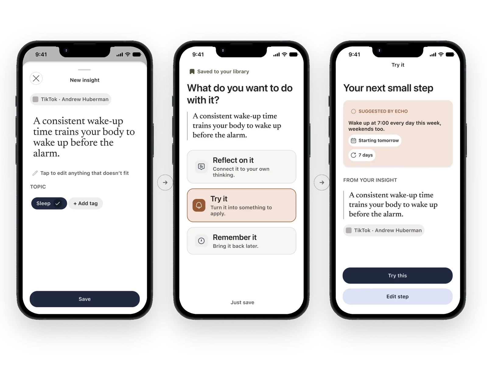
A cooking tip is worth trying. A psychological idea is worth thinking about. A fact might only need remembering. So I kept the research insight and dropped the rigid sequence.
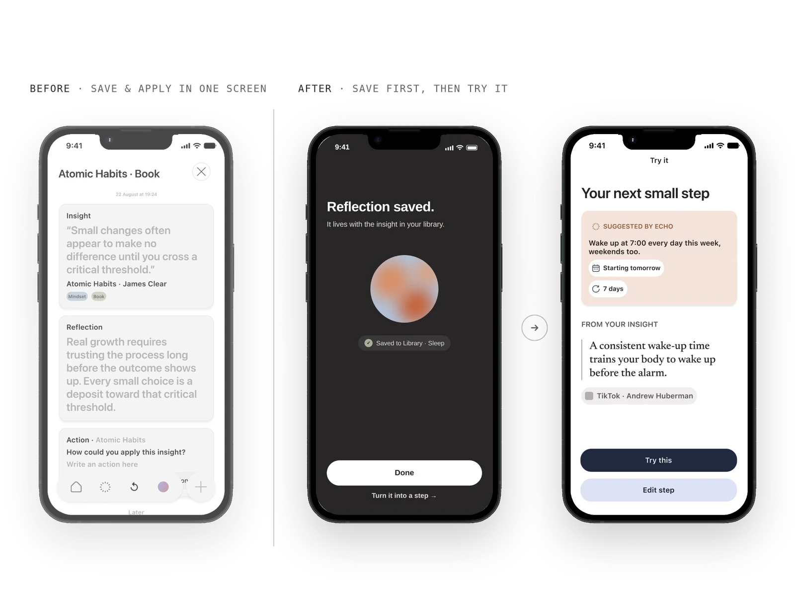
A clickable product concept and a reusable UI system.
- CaptureBring useful content into echo from different sources.
- InsightsTurn scattered content into a curated personal library.
- ReflectionConnect an idea to your own context.
- ApplicationTranslate a relevant insight into a concrete action.
- RediscoveryResurface ideas without turning learning into a test.
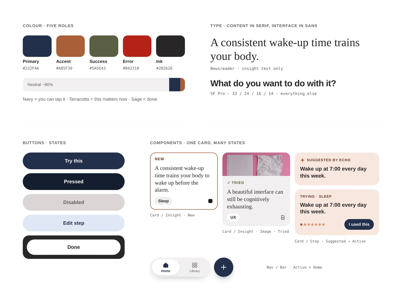
The visual system pairs digital restraint with editorial curation. The interface is about 90% neutral, and every colour has one job: navy means you can tap it, terracotta means this matters now, sage means done. Insights are set in a serif (Newsreader) so they read like something worth keeping, while the interface itself uses SF Pro. One card component carries every state an insight goes through, from new to tried to reflected. It's all built on a 4-column mobile grid and an 8-pt spacing system, with an accessibility checklist.
Success isn't how much people save.
It's what happens afterwards. Can a saved insight become something someone meaningfully engages with or applies? I defined the metrics around that question, using the HEART framework.
Applied insights per active user per week
Supported byResearch changes the question. Testing changes the model.
- 01
Start by doubting your own brief. I began with a memory problem and ended with a meaning problem. The whole product changed because of that shift.
- 02
Test the mental model, not only the screens. The friction at “Save & Apply” wasn't a button problem. It showed that one fixed sequence couldn't fit every kind of idea.
- 03
Simpler is a design decision. Going from four fixed steps to three optional paths kept the insight and removed the rigidity.
Want to hear the full story?